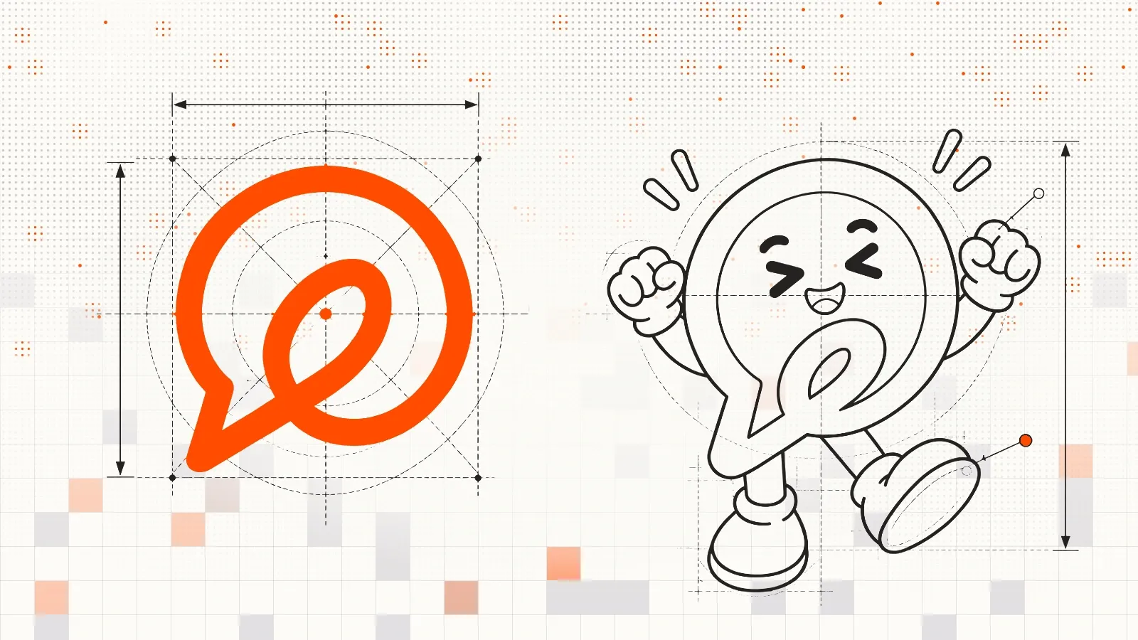
When we started ThriveDesk, almost all of our time went into the product. The brand got what was left, which wasn’t much. We picked a stock icon, changed it a little, and that became our logo.
For where we were, that was the right call. We were a small team with a big ambition.
But a logo you pick without much thought has a way of sticking around, and ours stayed far longer than we planned (5+ years).
A lot has changed since then.
ThriveDesk now has thousands of customers, and it’s growing from a simple helpdesk into AI-native customer service software for Ecommerce brands. An AI agent answers shoppers at any hour, and your team steps in when a person is needed. Our new AI strategy requires new branding, should be fun and playful.
The story behind the new mark
When we sat down to design a real logo, we started with where ThriveDesk came from. Our first product was a helpdesk, and a helpdesk is a shared inbox at heart: one place where a team reads and answers customer email together.
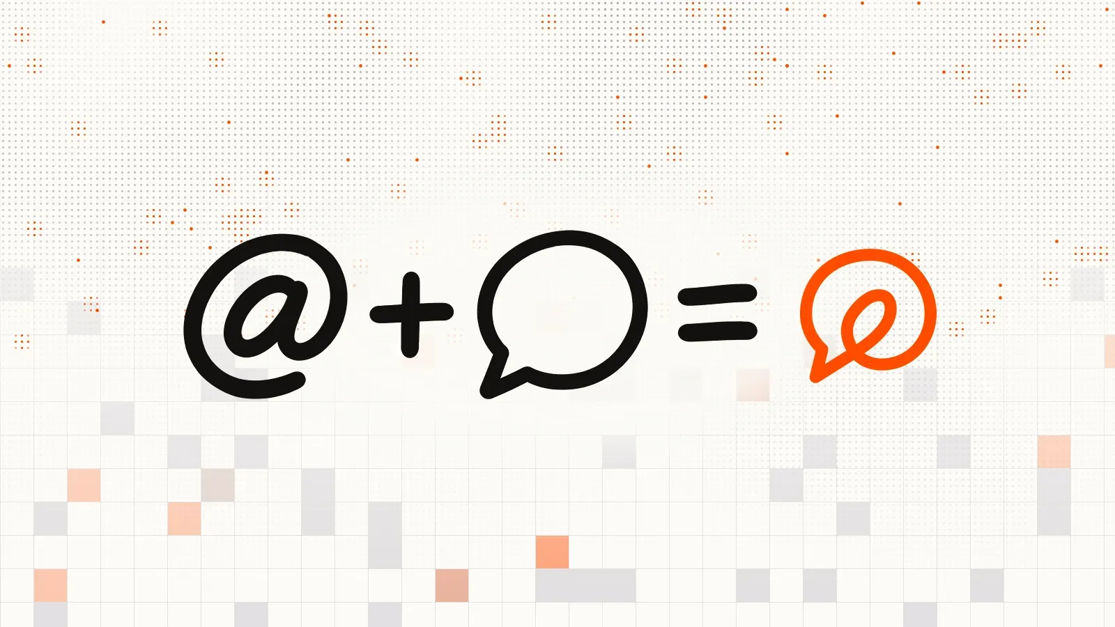
So we looked for the symbol that belongs to email more than any other, and that was the @. You can’t write an email address without it, and people recognize it at a glance in almost any language.
As helpdesk has matured enough, our main focus has moved to chat. So the new mark puts the two together. The @ sits inside a chat bubble, and its inner loop runs out to become the bubble’s tail, so the whole thing reads as one continuous line instead of two icons placed side by side.
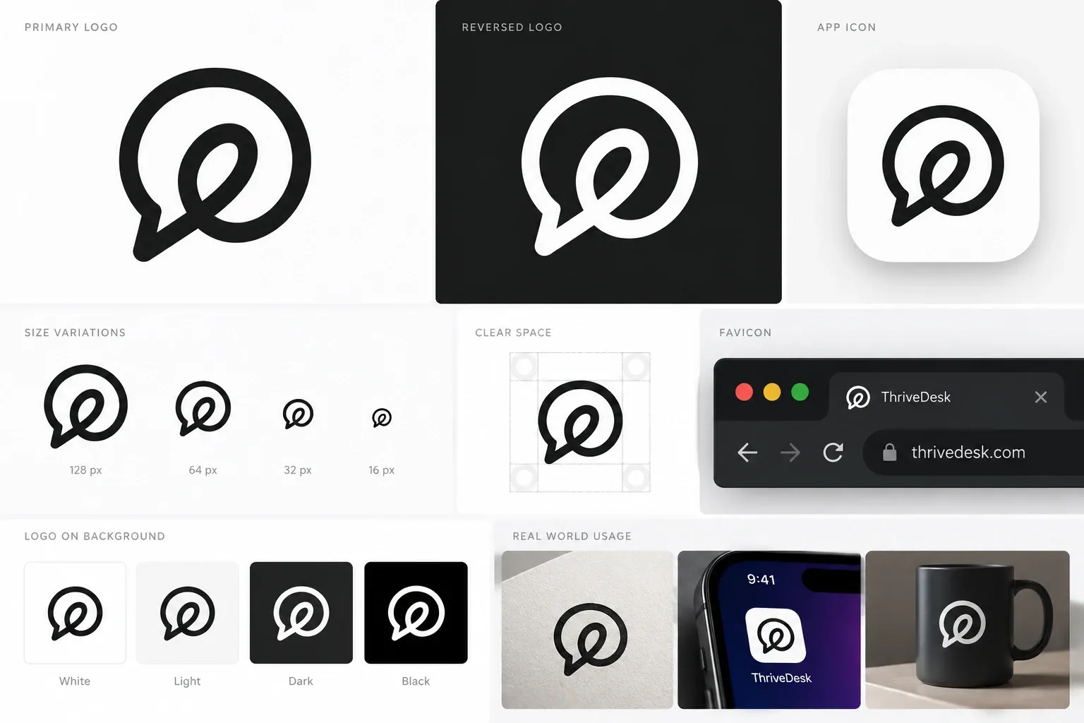
The mark works at any size, from an app icon down to a 16-pixel browser tab. You can find every version, along with our colors and type, on our brand guidelines page.
We need a mascot too
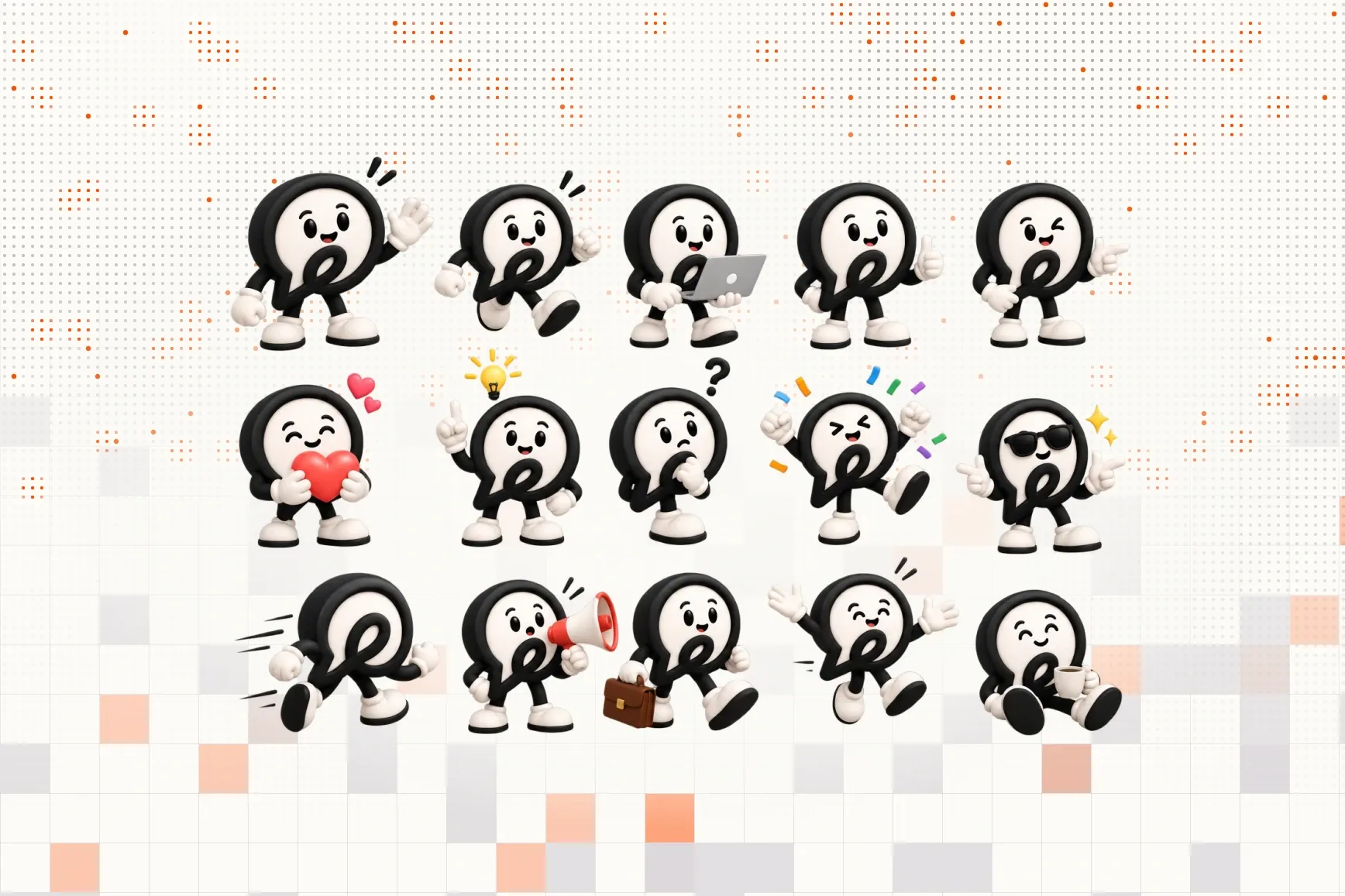
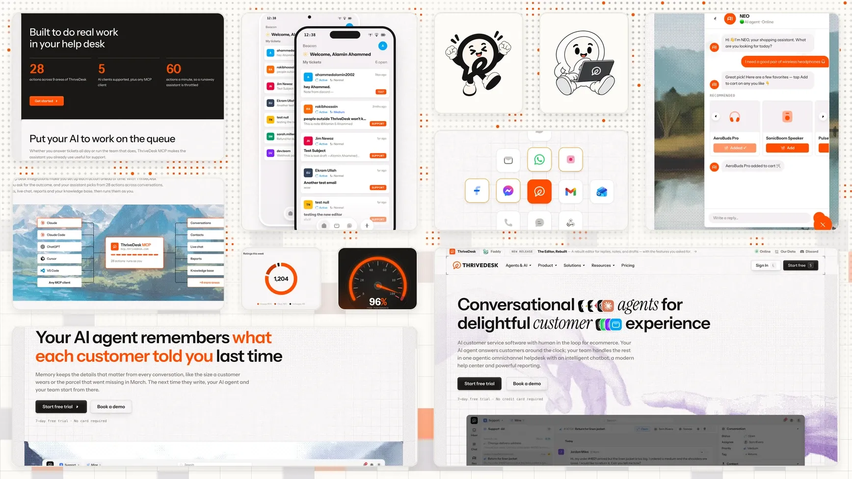
Meet NEO, your friendly neighborhood yapper. It’s the same bubble and @ loop, with a face, white gloves and sneakers. Neo is also the name of our AI agent, so the agent that answers your customers now has a face. How cool is that?
Why we changed and how we describe ThriveDesk
Most of the stores we work with have small support teams. Their shoppers ask about orders and returns, often outside office hours, and they want fast answers. So we built ThriveDesk around those questions. It pulls order details from Shopify or WooCommerce. The AI agent answers the routine questions, and your team handles the rest from the same inbox.
NEO can answer questions about your inventory, shipping status, and many more. Add your brand voice, guardrails and escalation path and you have a perfect agent helping your customer 24/7.
The new look
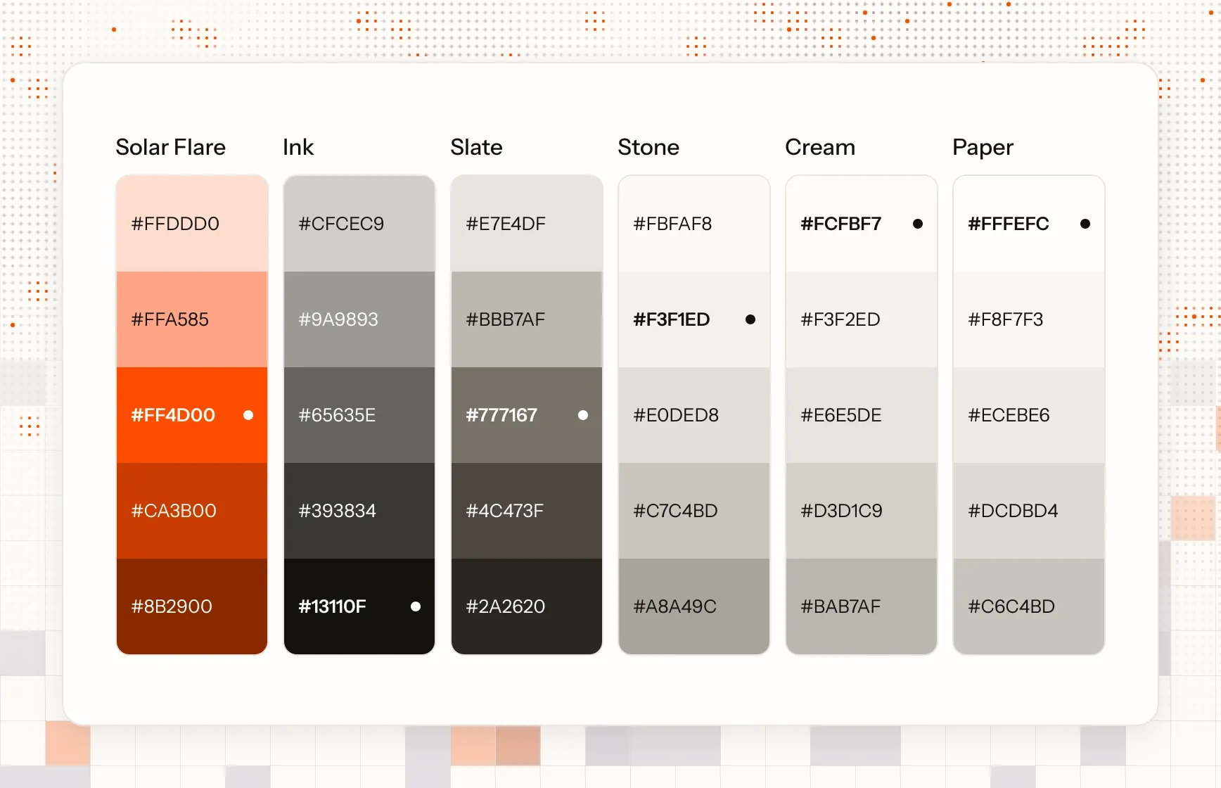
Our brand color is Solar Flare, a bright orange. We use very little of it, mostly on the mark, links and highlights, so it stands out when it appears. Everything else is warm neutrals: cream backgrounds and near-black ink.
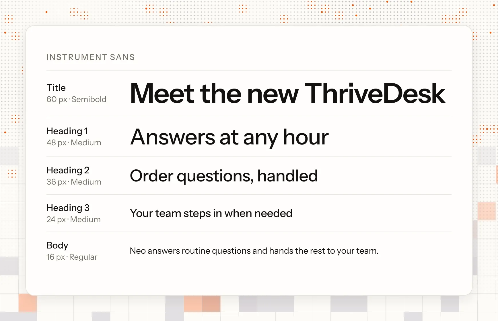
Our typeface is Instrument Sans. It stays easy to read at small sizes and has enough character for big headlines. We use one type scale across the whole site, so a heading on the blog matches a heading on the pricing page.
A new website
We also rebuilt thrivedesk.com from scratch. Previously the site was in WordPress and we moved it to AstroJS. WordPress served the purpose, and this move was needed to scale the brand.
Freshly redesigned app
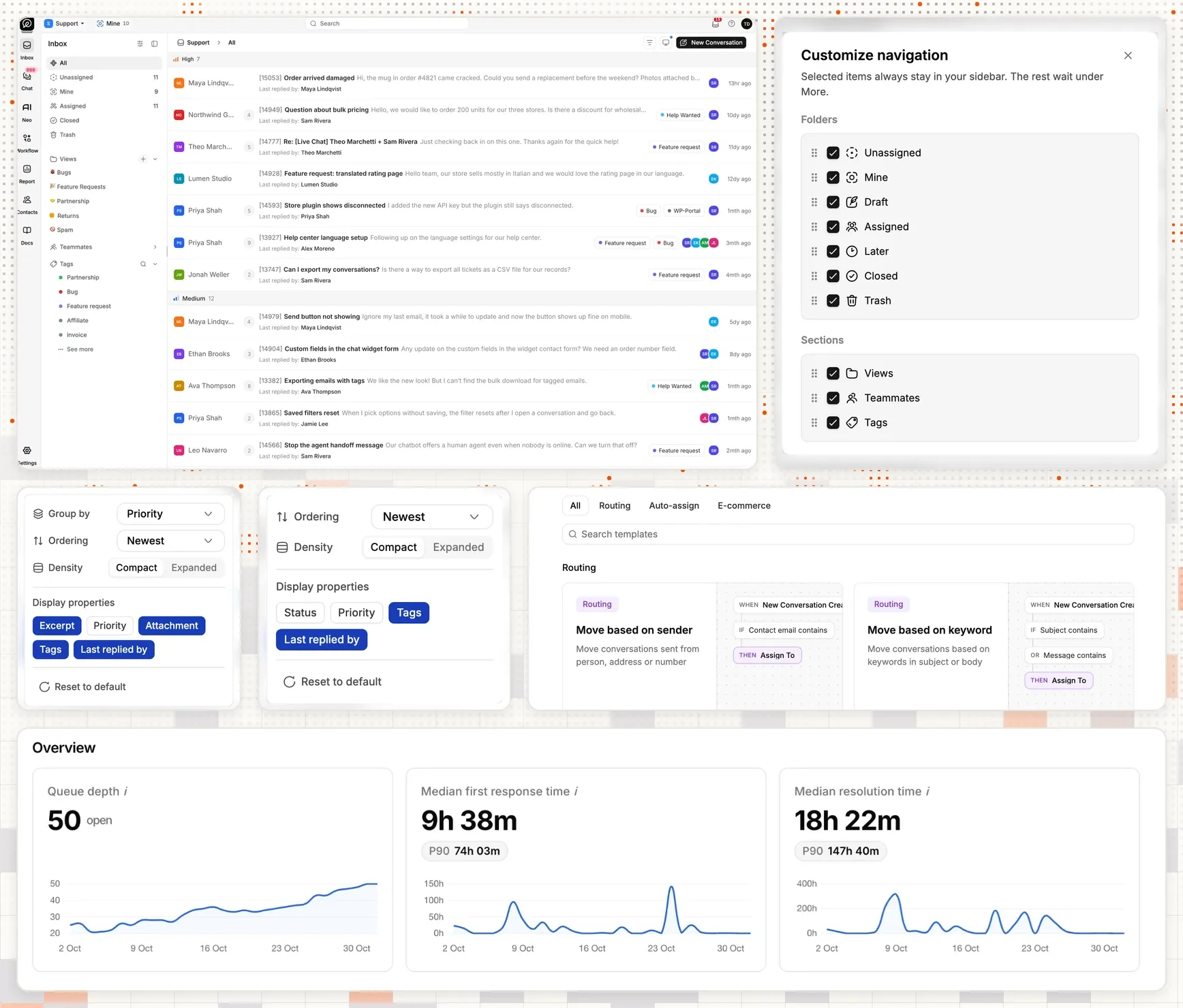
We also redesigned the whole app from scratch. It gets its own post at release, so for now, here’s a sneak peek.
Nothing changes in how you use ThriveDesk. Your account, data, plan and price stay as they are. Your integrations keep working, and the same team answers when you write to us. You don’t need to do anything.
Thank you to everyone who has used ThriveDesk over the years. Your feature requests and bug reports shaped much of the product. Take a look around the new site, and if something feels off, reply to any of our emails.